|
|
| Welcome Guest ( Login | Register ) | Browse | Search | Files | Chat |
| Forum Home > Comics, Screenshots, etc. > Original creations > Drawings By Arme and Others? |
| Drawings By Arme and Others?, Post your drawings/pictures/creations | |||
| Mari | 4:51 PM on December 10, 2012 | (+1/-0) | |
 Group: Members Posts: 1 Total: 32 |
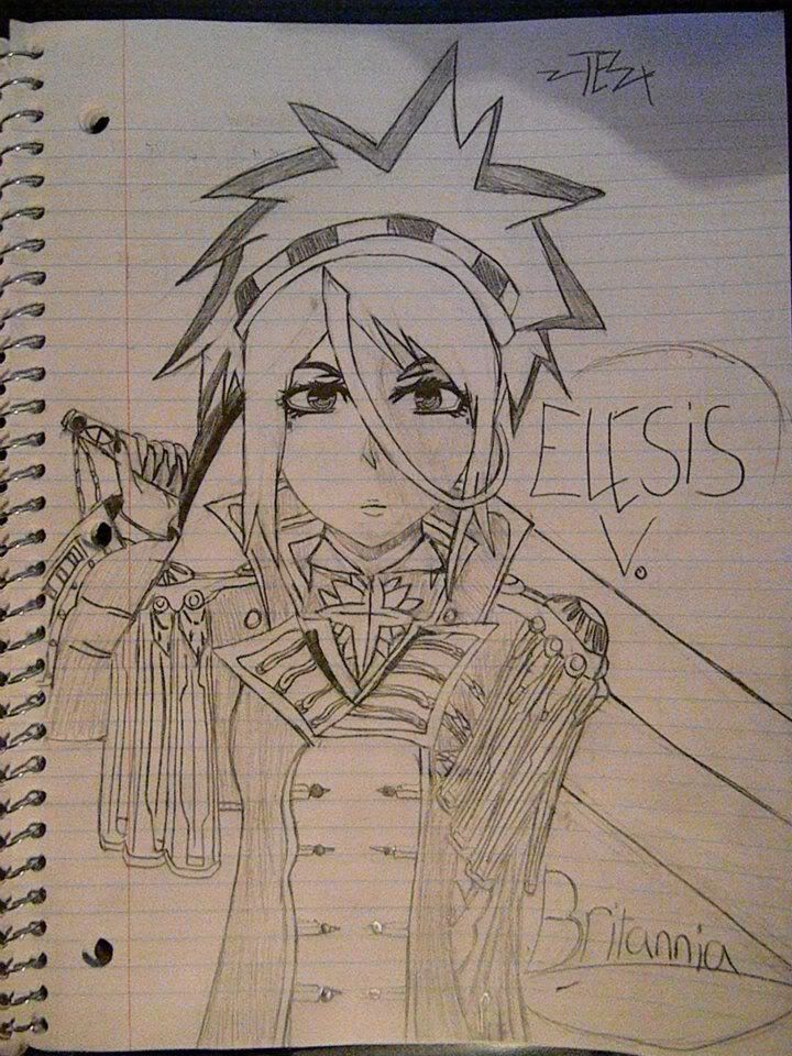
A drawing of my Knight. Only thing I hate about it is that i placed the thumb on the wrong side of the hilt so it looks super funny. D:
 I was into alot of Zombie Animes at the time, so i decided fuck it imma draw my own anime drawing, i only ended up making hte cover and another page. Lol 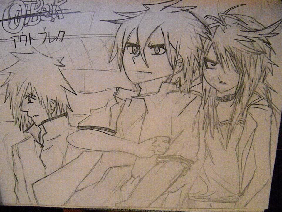 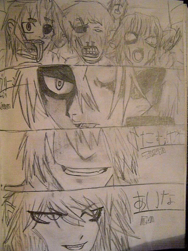 I used to belong to this shuffling crew in my state but i ended up leaving because the leader was being a dick and i almost threw her down a flight of stairs starting with head first. But i still like the logo i did for us. 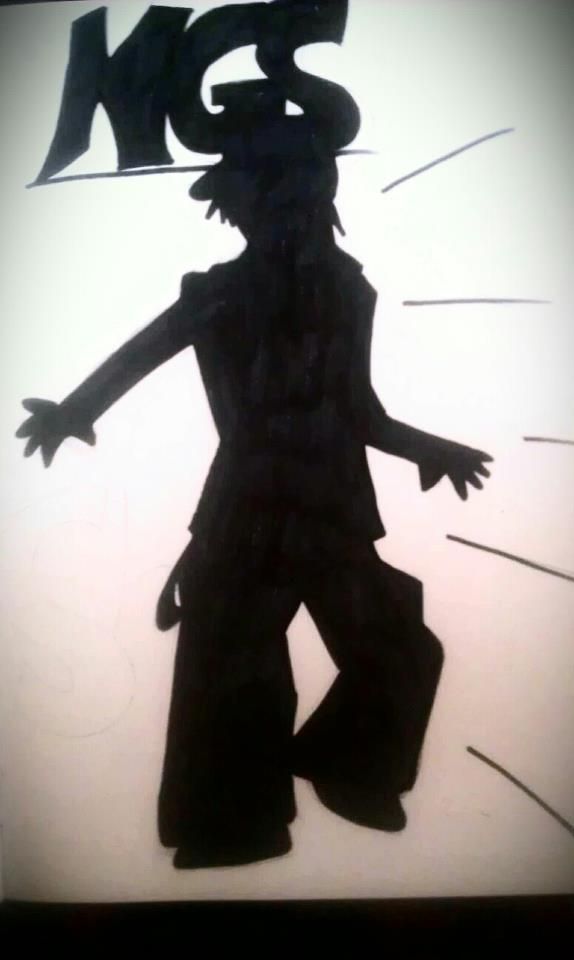 Kingdom Hearts picture I drew, I drew this after playing 365/2 Days for DS 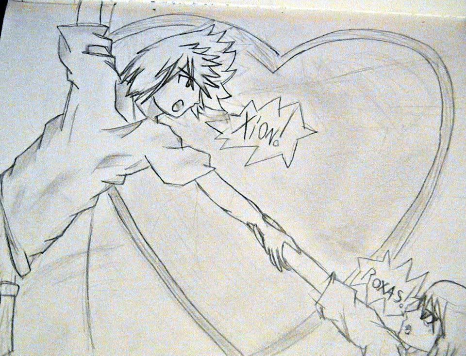 _________________________________________ |
||
| Dr. Letha | 4:58 PM on December 10, 2012 | (+1/-0) | |
| Group: Shitlisted Posts: 128 Total: 1836 |
Mari wrote:
pictures First one has a few proportion issues, but otherwise, it's rather nice, if not a little over-the-top (but hey, if you're gonna be a cool character, might as well do it with flair). I love the zombie ones, the top-left zombie is the most zombie-looking one in my opinion. I like the crew design. Shoulda decked the leader :B lolkingdomhearts All artists need improvement, but still, I like these a lot.~ _________________________________________  |
||
| MaoiYaoi | 10:54 PM on December 10, 2012 | (+2/-2) | |
| Group: Members Posts: 7 Total: 100 |
These all make me want to kill myself
First, your knight has no shape to her body, and is she an indian? Looks like it via headpiece, overall shit Second, none of them look like zombies, kill yourself Third, lil more zombielike, but no, dropped the ball Fourth pic has no detail, its justa figure with letters, the leader of them deserved to be a dick to you if that's the quality you put in And finally, fuck any kh that isn't 1 or 2 because its stupid bullshit, and thusly, fuck yo drawing Please kill yourself, that is all _________________________________________ |
||
| Mint | 11:06 PM on December 10, 2012 | (+1/-0) | |
| Group: Blundering Posts: 9 Total: 234 |
Didn't you say you were taking art classes? Stop sleeping in class.
_________________________________________ |
||
| Sinsie | 12:39 AM on December 11, 2012 | (+0/-0) | |
 Group: NEENJ Posts: 13 Total: 682 |
Man, being so rude to the person who's a jumbled typo of my own name. What miserable cretins.
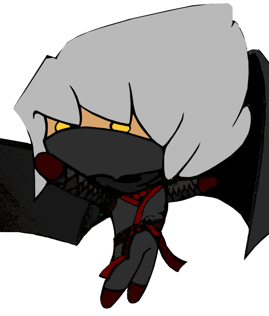
Picture Number One: Liking the face. Hair isn't as good but that's because you seem to be drawing based off anime images. And some anime hair isn't that detailed. My personal guess is that if you spent time practicing drawing separate parts of the body such as hair and eyes and other features in different ways from memory, you'd develop a feel for putting such things together and have a "fashion sense" of sorts in determining what's appropriate and what brings out a good look. I'm liking how you're able to add as much detail as is necessary for your assignment, obviously stuff like the hand and arm position needs work, but from my own experience this is simply hard to do and takes its own specific kind of practice to master. Looking at the good parts of this picture, in my opinion you have it in you to get these things down. The only question is would you turn what may be fun into work in order to improve overall quality, or can you deal with the small stuff and just continue on with what you're doing? Artists tend to fall in one of those two categories, so some artists will get really good at what they do and cover up their weak spots noticeably, or some take a certain amount of pride in their work and go through the less fun exercises to strive for better artwork. But enough commentary on this, Hail Britannia! Image Two: Liking the hair on the chick to the right (gosh I hope she's a chick). You seem to have your tropes down at least. Clothing and arm positions seem decent-to-good, guy on the left's head and nose seem a little stretched out but I'm sure you noticed that on your own. I would try to make the faces more rounded out but that's my own flavor. Zombies are weird to critique because they's falling apart. The one on the left's tongue seems to be coming from too high though. It looks like his tongue grows out of the roof of his mouth. His good eye also takes away from the zombie effect. This simply comes down to taste but I would have a sad or droopy eye even if the eye is perfectly fine. Anything little can still add to an image as a whole, and a lot of artwork takes advantage of these subtle add-ons to influence the overall experience one gets from viewing artwork. Unlike real life, an image is judged on everything in it and everything affects the main part of the image and vice versa, so there's a bit of a trick to how realistic you make an artwork versus how romantic/poetic you make it for flavoring. The bottom three face-off screens of the zombie image are fine. The only issue I'd bring up is again, it's based off established anime cliches. This is fine itself if you prefer it, but when exposing your work to others, one of the first things to pop up to mind, if not the first thing, is "more of the same". It's hard to be creative and make something no one hasn't seen (because everyone's done everything by this point in history), but what I find helps is drawing from personal experience and trying to add in elements from real-life dealings with people in certain situations close to what you're drawing about, and maybe imagining in your head the different outcomes the situation or people could have performed. Still, you set out to make a zombie scene and that's what you did, so good job. You can clearly tell right away what's happening and that's always a big thing to nail down in the art scene. Image Number Three: It's a shadow. Hard to comment since one of the points of shadow images is you can't actually see the detail. If it isn't supposed to have any big meaning, it's fine. If you ever do try to convey a point with one though, you'll need much more detail with the outline, something to provoke the audience to ponder what the character is doing, why he's doing it, what his body posture and hand placements could suggest, that kind of rad stuff. Anyways, like I said, not much to go off of so it's pointless to ramble (like that'll stop me). Image Number Four: Cute. Good job with the arm in this one. Actually the body seems pretty good to me, nothing apparent comes to mind. Hair is a bit weird naturally but that's an anime hair thang. Note on art class, since it was brought up: an art class is typically going to clash with the anime style, because anime is like an art direction that shoots for a certain appeal and sticks with it. There's not that much to improve on (what I mean by this is compared to drawing in any style of art versus a few specific and easily recognizable ones). But it's still a good thing to try and learn what art classes have to offer, even if you treat it as separate from your other artwork. It's a good source of inspiration and creativity, and in general should offer great ways to practice technique and apply what you learn in general for whatever you wish to output. You yourself didn't mention art class, so it's possible you don't need no lip from me. Sorry for digressing! It's tough putting yourself out there in any form, even if it's only a small number of viewers (maybe I'm just a pussy cat), so props to you. Either do your best to improve, (de)appreciate the criticism, stick to what you like, do whatever satisfies you at the end of the day. Take care similar name buddy. _________________________________________  |
||
| Cea | 1:17 AM on December 11, 2012 | (+0/-0) | |
 Group: Cea Posts: 89 Total: 1990 |
The first one isn't over the top doofus that's normal for Brittanian royalty.
_________________________________________ A good player knows how to play his class. An elitist knows how to play everyone else's class.
 |
||
| Professor | 2:00 AM on December 11, 2012 | (+0/-0) | |
 Group: NEENJ Posts: 24 Total: 942 |
Sinsie wrote:
Man, being so rude to the person who's a jumbled typo of my own name. What miserable cretins.I agree. Picture Number One: Liking the face. Hair isn't as good but that's because you seem to be drawing based off anime images. And some anime hair isn't that detailed. My personal guess is that if you spent time practicing drawing separate parts of the body such as hair and eyes and other features in different ways from memory, you'd develop a feel for putting such things together and have a "fashion sense" of sorts in determining what's appropriate and what brings out a good look.I agree. I'm liking how you're able to add as much detail as is necessary for your assignment, obviously stuff like the hand and arm position needs work, but from my own experience this is simply hard to do and takes its own specific kind of practice to master. Looking at the good parts of this picture, in my opinion you have it in you to get these things down. The only question is would you turn what may be fun into work in order to improve overall quality, or can you deal with the small stuff and just continue on with what you're doing? Artists tend to fall in one of those two categories, so some artists will get really good at what they do and cover up their weak spots noticeably, or some take a certain amount of pride in their work and go through the less fun exercises to strive for better artwork. But enough commentary on this, Hail Britannia!I agree. Image Two: Liking the hair on the chick to the right (gosh I hope she's a chick). You seem to have your tropes down at least. Clothing and arm positions seem decent-to-good, guy on the left's head and nose seem a little stretched out but I'm sure you noticed that on your own. I would try to make the faces more rounded out but that's my own flavor.I agree. Zombies are weird to critique because they's falling apart. The one on the left's tongue seems to be coming from too high though. It looks like his tongue grows out of the roof of his mouth. His good eye also takes away from the zombie effect. This simply comes down to taste but I would have a sad or droopy eye even if the eye is perfectly fine. Anything little can still add to an image as a whole, and a lot of artwork takes advantage of these subtle add-ons to influence the overall experience one gets from viewing artwork. Unlike real life, an image is judged on everything in it and everything affects the main part of the image and vice versa, so there's a bit of a trick to how realistic you make an artwork versus how romantic/poetic you make it for flavoring.I agree. The bottom three face-off screens of the zombie image are fine. The only issue I'd bring up is again, it's based off established anime cliches. This is fine itself if you prefer it, but when exposing your work to others, one of the first things to pop up to mind, if not the first thing, is "more of the same". It's hard to be creative and make something no one hasn't seen (because everyone's done everything by this point in history), but what I find helps is drawing from personal experience and trying to add in elements from real-life dealings with people in certain situations close to what you're drawing about, and maybe imagining in your head the different outcomes the situation or people could have performed.I agree. Still, you set out to make a zombie scene and that's what you did, so good job. You can clearly tell right away what's happening and that's always a big thing to nail down in the art scene.I agree. Image Number Three: It's a shadow. Hard to comment since one of the points of shadow images is you can't actually see the detail. If it isn't supposed to have any big meaning, it's fine. If you ever do try to convey a point with one though, you'll need much more detail with the outline, something to provoke the audience to ponder what the character is doing, why he's doing it, what his body posture and hand placements could suggest, that kind of rad stuff. Anyways, like I said, not much to go off of so it's pointless to ramble (like that'll stop me).I agree. Image Number Four: Cute. Good job with the arm in this one. Actually the body seems pretty good to me, nothing apparent comes to mind. Hair is a bit weird naturally but that's an anime hair thang.I agree. Note on art class, since it was brought up: an art class is typically going to clash with the anime style, because anime is like an art direction that shoots for a certain appeal and sticks with it. There's not that much to improve on (what I mean by this is compared to drawing in any style of art versus a few specific and easily recognizable ones). But it's still a good thing to try and learn what art classes have to offer, even if you treat it as separate from your other artwork. It's a good source of inspiration and creativity, and in general should offer great ways to practice technique and apply what you learn in general for whatever you wish to output. You yourself didn't mention art class, so it's possible you don't need no lip from me. Sorry for digressing!I agree. It's tough putting yourself out there in any form, even if it's only a small number of viewers (maybe I'm just a pussy cat), so props to you. Either do your best to improve, (de)appreciate the criticism, stick to what you like, do whatever satisfies you at the end of the day. Take care similar name buddy.I agree. _________________________________________  |
||
| Shane | 2:01 PM on December 11, 2012 | (+1/-1) | |
| Group: Members Posts: 61 Total: 1856 |
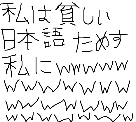
You write kana about as well as a three-year-old should.
Stop embarassing yourself to people who actually are fluent in Japanese. _________________________________________ SMUG.MOMENTAI
 |
||
| Nabutso Zaih | 3:30 PM on December 11, 2012 | (+0/-0) | |
| Group: Members Posts: 9 Total: 489 |
Shane wrote:
You write kana about as well as a three-year-old should. because everyone whos fluent in japanese was instantly fluent and was never at the skill level of a 3 year old _________________________________________ |
||
| Sinsie | 3:54 PM on December 11, 2012 | (+0/-0) | |
 Group: NEENJ Posts: 13 Total: 682 |
I can read the names just fine. Japanese calligraphy of the highest quality isn't needed here in my humble opinion, sir.
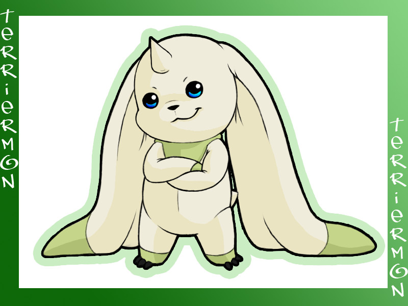
Also I'm sorry I didn't watch the anime I SENT YOU CEA-CHAN!!! _________________________________________  |
||
| Cea | 3:55 PM on December 11, 2012 | (+0/-0) | |
 Group: Cea Posts: 89 Total: 1990 |
Nabutso Zaih wrote:
Shane wrote:You write kana about as well as a three-year-old should. You don't have to be great to start, but you have to start to be great. Besides; Nabutso and his girlfriend can write kana better than you could ever possibly dream of doing!!! _________________________________________ A good player knows how to play his class. An elitist knows how to play everyone else's class.
 |
||
| Shane | 3:57 PM on December 11, 2012 | (+0/-0) | |
| Group: Members Posts: 61 Total: 1856 |
Nabutso Zaih wrote:
Shane wrote:You write kana about as well as a three-year-old should. Given the nature of the language in its written form, penmanship is extremely important. Being a calligraphy god isn't, but it's still good not to seem like you wrote it holding the pencil with your ass. _________________________________________ SMUG.MOMENTAI
 |
||
| Sinsie | 4:16 PM on December 11, 2012 | (+0/-0) | |
 Group: NEENJ Posts: 13 Total: 682 |
 _________________________________________  |
||
| Shane | 4:19 PM on December 11, 2012 | (+0/-0) | |
| Group: Members Posts: 61 Total: 1856 |
|||
| Cea | 4:22 PM on December 11, 2012 | (+0/-0) | |
 Group: Cea Posts: 89 Total: 1990 |
*I hi-five Sinsie and we clasp hands and skip off into the sunset writing crappy Japanese kana in the air and singing in broken grammar*
_________________________________________ A good player knows how to play his class. An elitist knows how to play everyone else's class.
 |
||
| Forum Home > Comics, Screenshots, etc. > Original creations > Drawings By Arme and Others? |
| 1 forum user ( 0 registered, 1 guest, 0 bots ) currently viewing this topic. |
|
This page was generated in 0.5 seconds.
Terulia forums are hosted for free at www.terulia.com [ Terms of Service: Updated 4/28/2011 ]. |